

Tampax - Brand/Packaging Update
︎ 2021
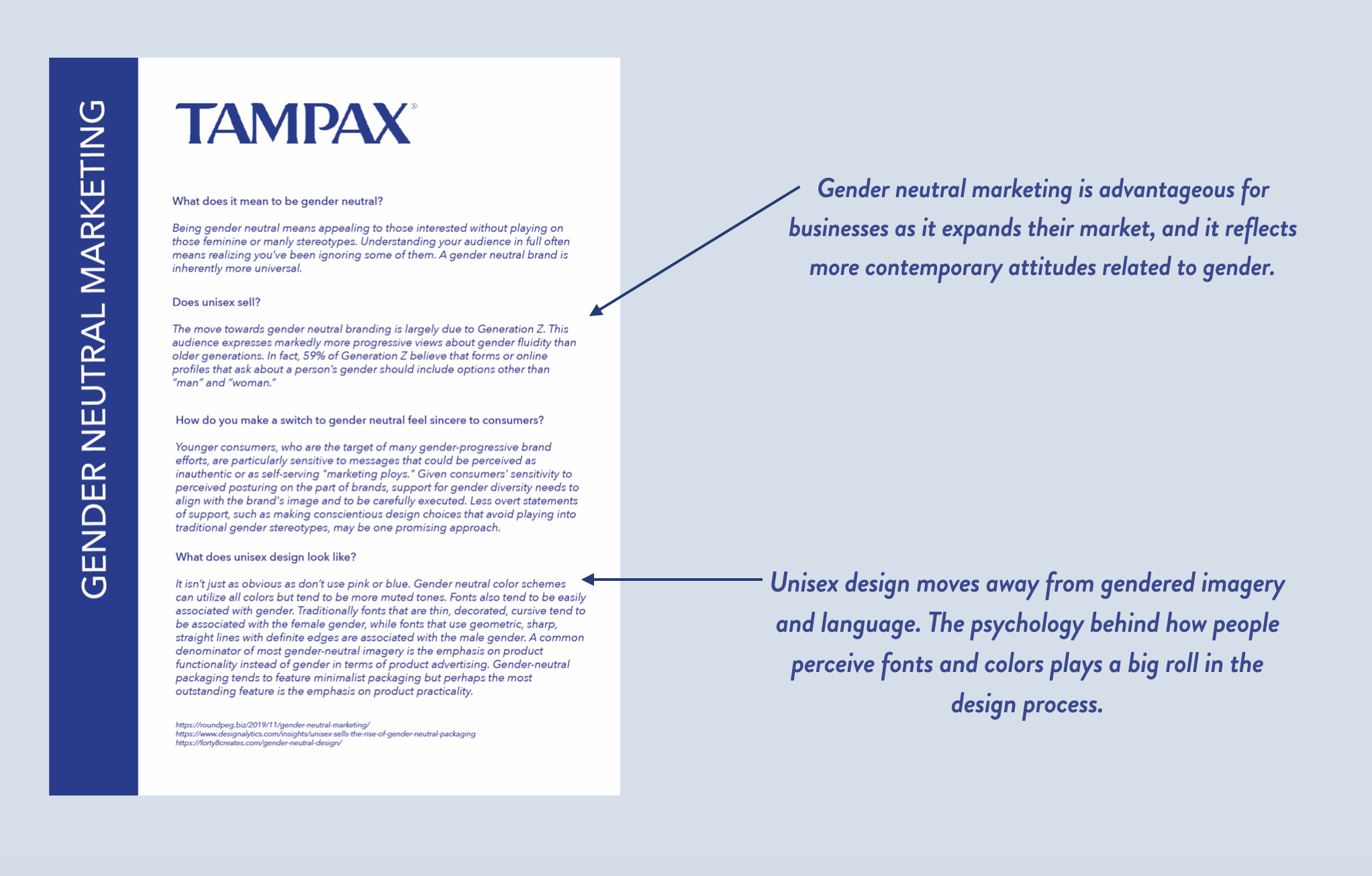
The social climate around menstruation is changing. Marketing period products as feminine products is failing to serve the already underrepresented population of people who don’t identify as female but still experience menstruation. Tampax has been a leading innovator in the menstrual product industry for 80 years, so it feels only fitting that they set a new precedence for removing gender-exclusive language and imagery from their products.
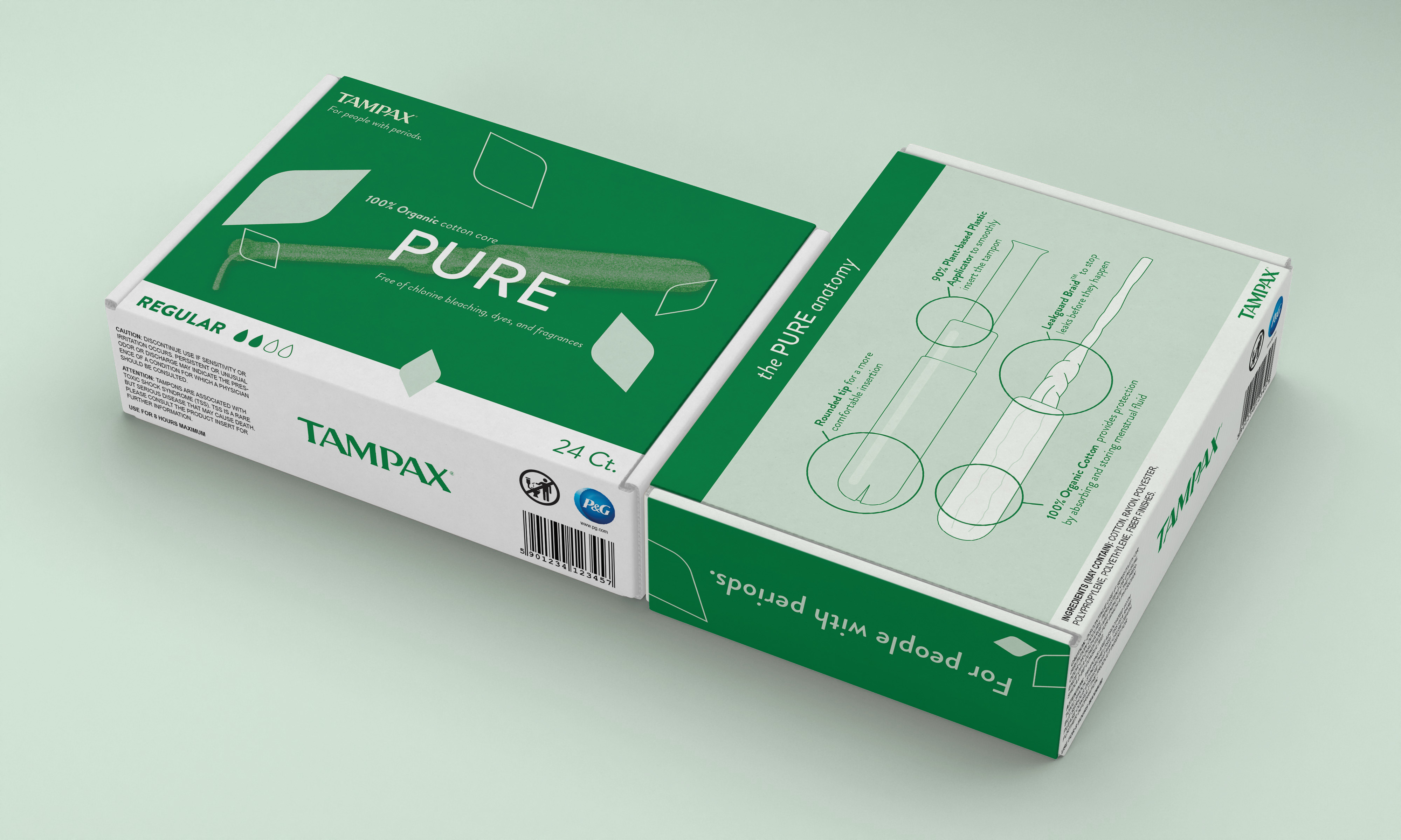
My proposal is to evolve Tampax’s brand into one that feels universally approachable and is free of gendered language and imagery. The new Tampax will feel safe and comfortable for anyone who has a period. A fresh modern look will reflect the contemporary ideals Tampax is adopting and hoping to make the industry standard. The re-brand will also focus on merging the different looks and feels of their PURE line with the rest of their products.

I first did research on Tampax as a brand. Here I attempted to identify their target audience, and do a needs assessment. This helped me identify the key issues with their product messaging and design, and gave me a goal for my rebranding proposal.
With my new focus on making the product gender-neutral, I then did research on what that would look like. I found products that don’t aim to highlight the gender of their audience focused more on product functionality.
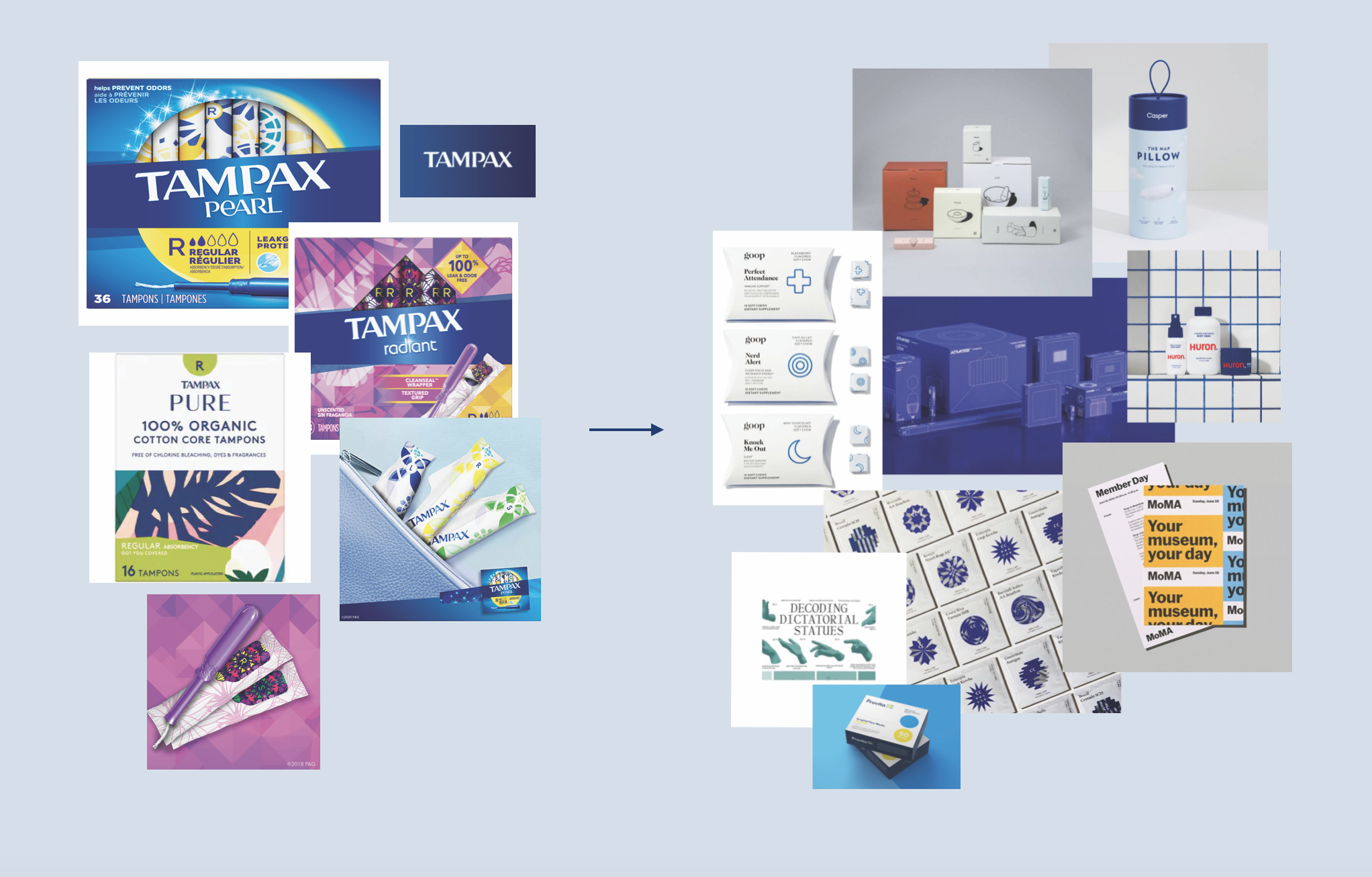
I made the moodboard above to help guide my design choices for the update to Tampax’s packaging. I found myself being drawn to products that belonged in the the bathroom or personal care category, and imagined that the new Tampax would become a part of this category too. In lieu of traditionally feminine colored florals and sparkles that had little to do with the actual product, I wanted my designs to focus on the product itself.
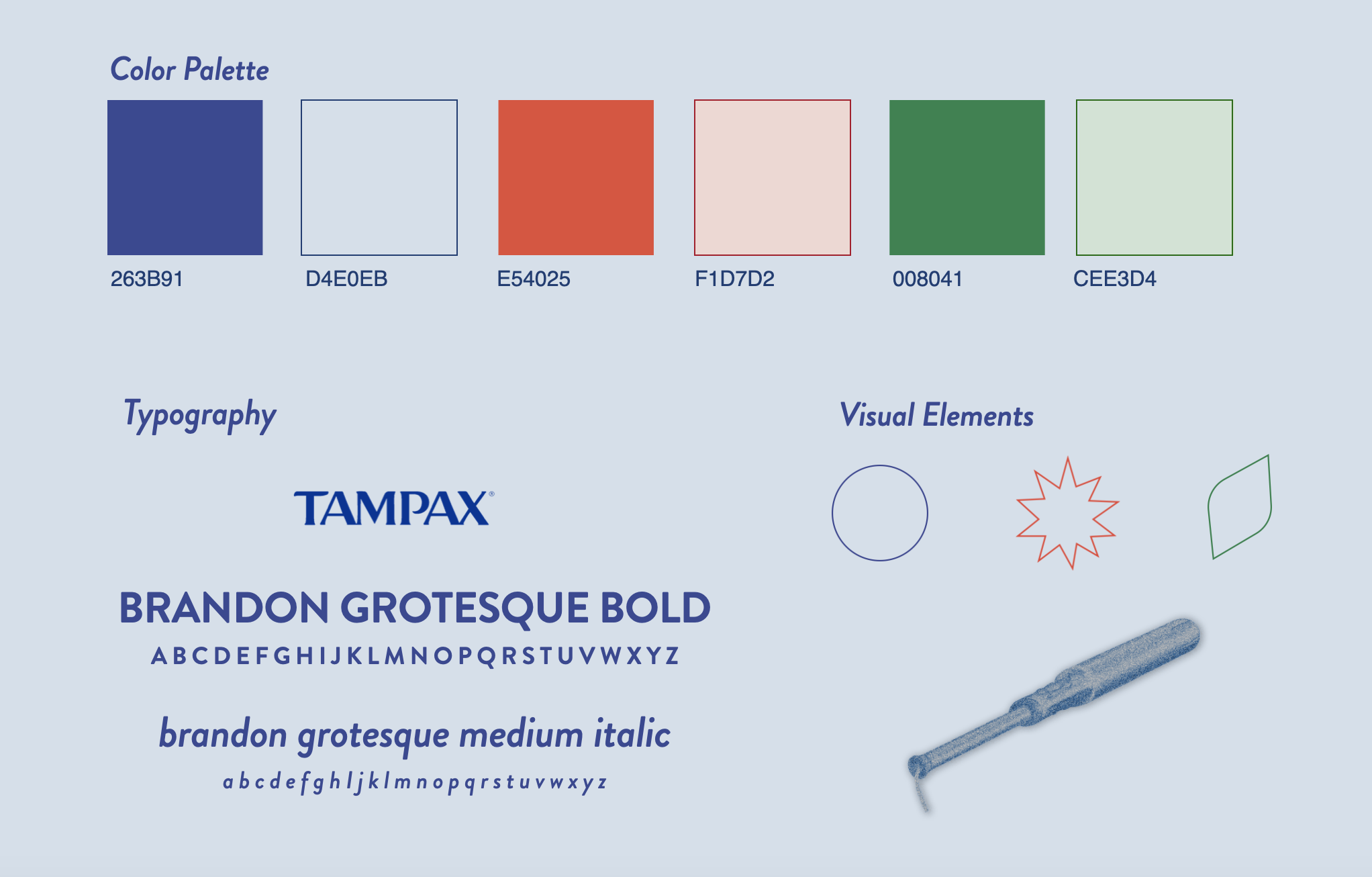
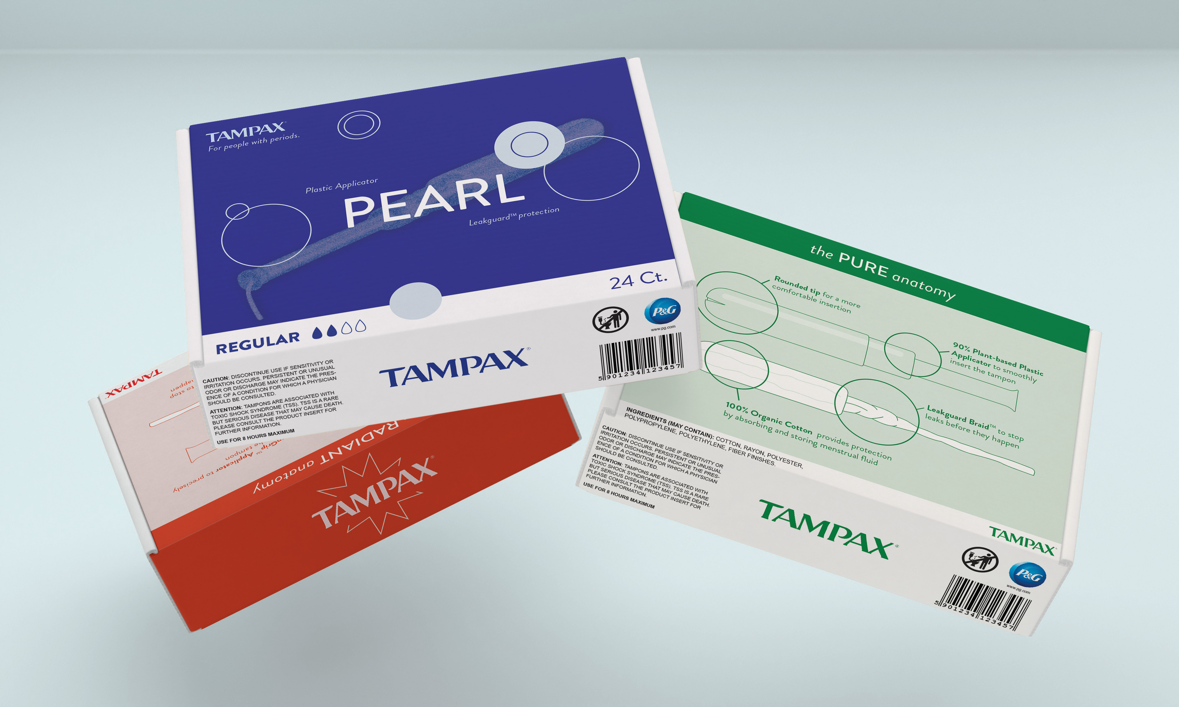
Utilizing Tampax’s standing logo, the new product designs utilize colors and typography that avoid gendered connotations while still complimenting pieces of the older branding.
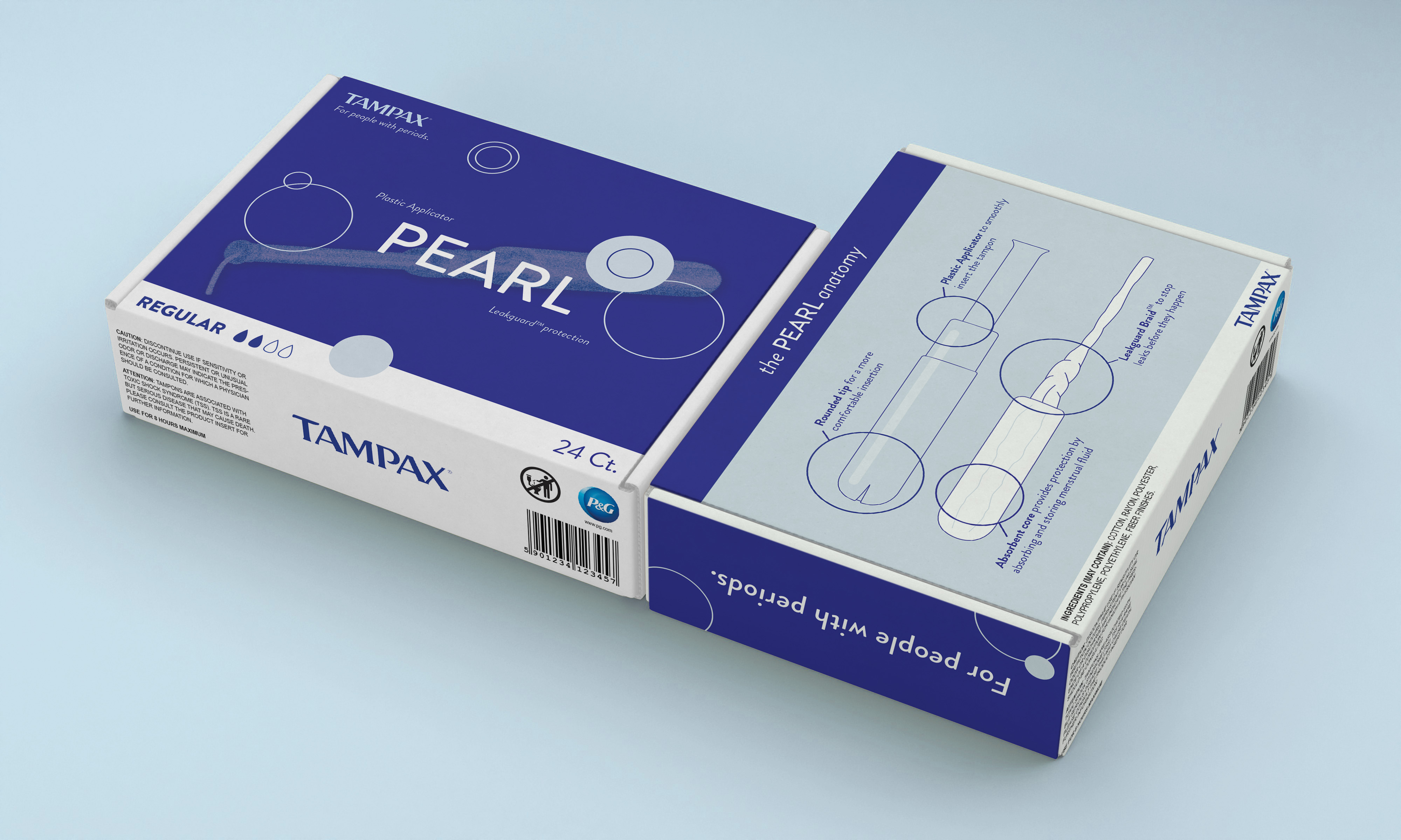
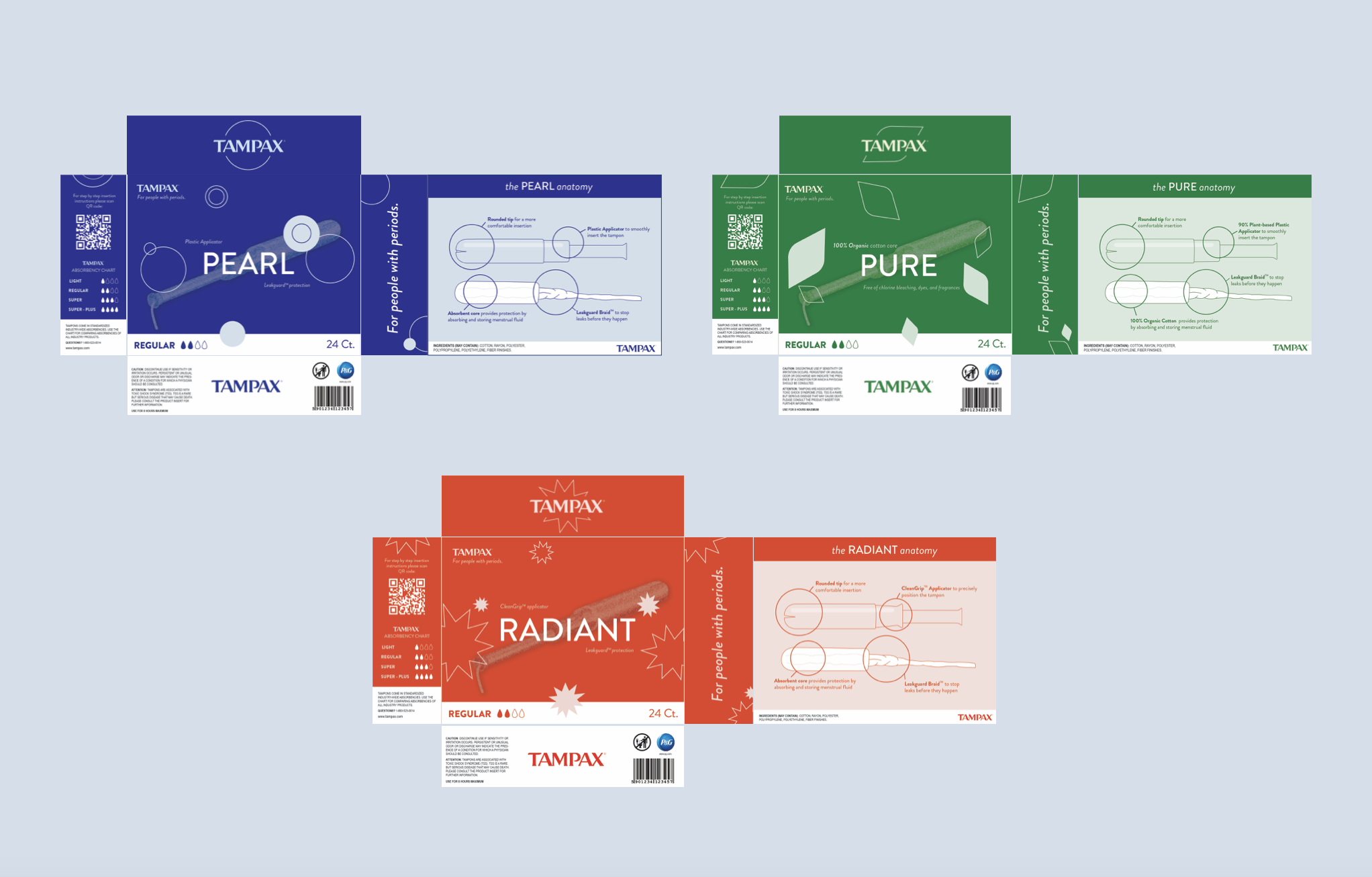
The front of the box highlights the specific features of each product line and includes an easily understood system noting the product’s level of absorbancy. On the reverse side, there is a more detailed illustrated diagram that showcases all of the technologies that have made Tampax the leading innovator in the menstrual product industry.

The smaller sides of the box are used to welcome the expanded audience and educate all users. One side includes an absorbancy chart, informing users of where a particular box falls within the full product line. It also has a QR code that links to educational resources Tampax has developed for users that are new to menstrual products. On the other small side, the newly imagined Tampax slogan lives simply and boldly – “For people with periods.” This message is exemplary of the shift Tampax is making, and it hopes to include people who menstruate and have historically been left out.
In addition to the packaging, I also developed a short animation to highlight the new look and messaging for Tampax’s brand. I imagine this acting as an announcement for their new campaign, or even an advertisement.

︎︎︎ Return to Design Work Gallery