

Troost - Typeface Design
︎ 2021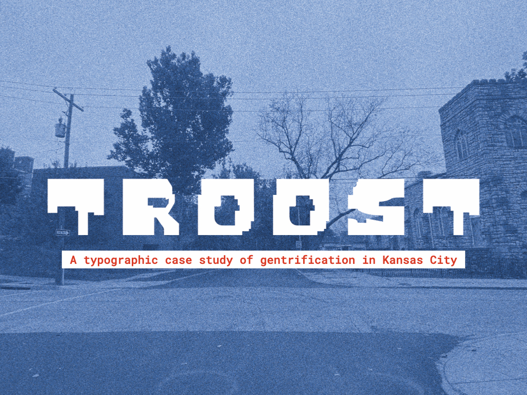
In 1954, when Brown v. Board of Education of Topeka was supposed to result in school desegregation, the local school district border was drawn at north/south running Troost Avenue, effectively segregating white students from black students. Since, Troost has been Kansas City’s symbolic and literal boundary due to redlining, discriminatory rental policies, and other institutionalized tools of oppression. As it stands now, neighborhoods west of Troost are white, and neighborhoods east of Troost are black. However, the presence and influence of white communities are moving east, encroaching on the long disenfranchised side of the avenue.
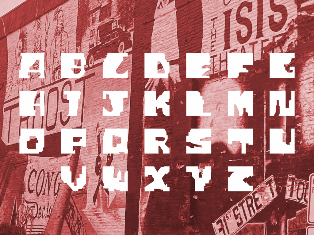
Troost, the typeface, has been built from the Kansas City communities east of the dividing line. It hopes to comment on what the neighborhoods have made out of the places they were forced into. While addressing the historic injustices the communities have faced, it also speaks to the current pressures they are under. Starting with a white box, exemplary of aesthetics of gentrification, the letters are then carved out. Using shapes and angles from the redlining map that built the city’s inequity, the white box is transformed into a letter with character.
With a direct reference to redlining in Kansas City, Troost is site-specific and visually tied to district lines. The typeface also has elements of ornate structure, a nod to historic, pre-gentrified architecture. Troost is meant for display, like the decorative fonts used on storefronts by small businesses. It is a type that embraces historic specialness in the face of the threat of gentrification.
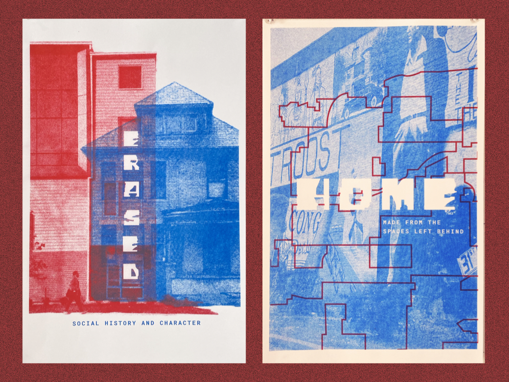
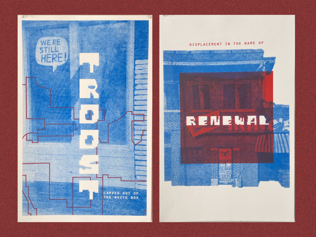
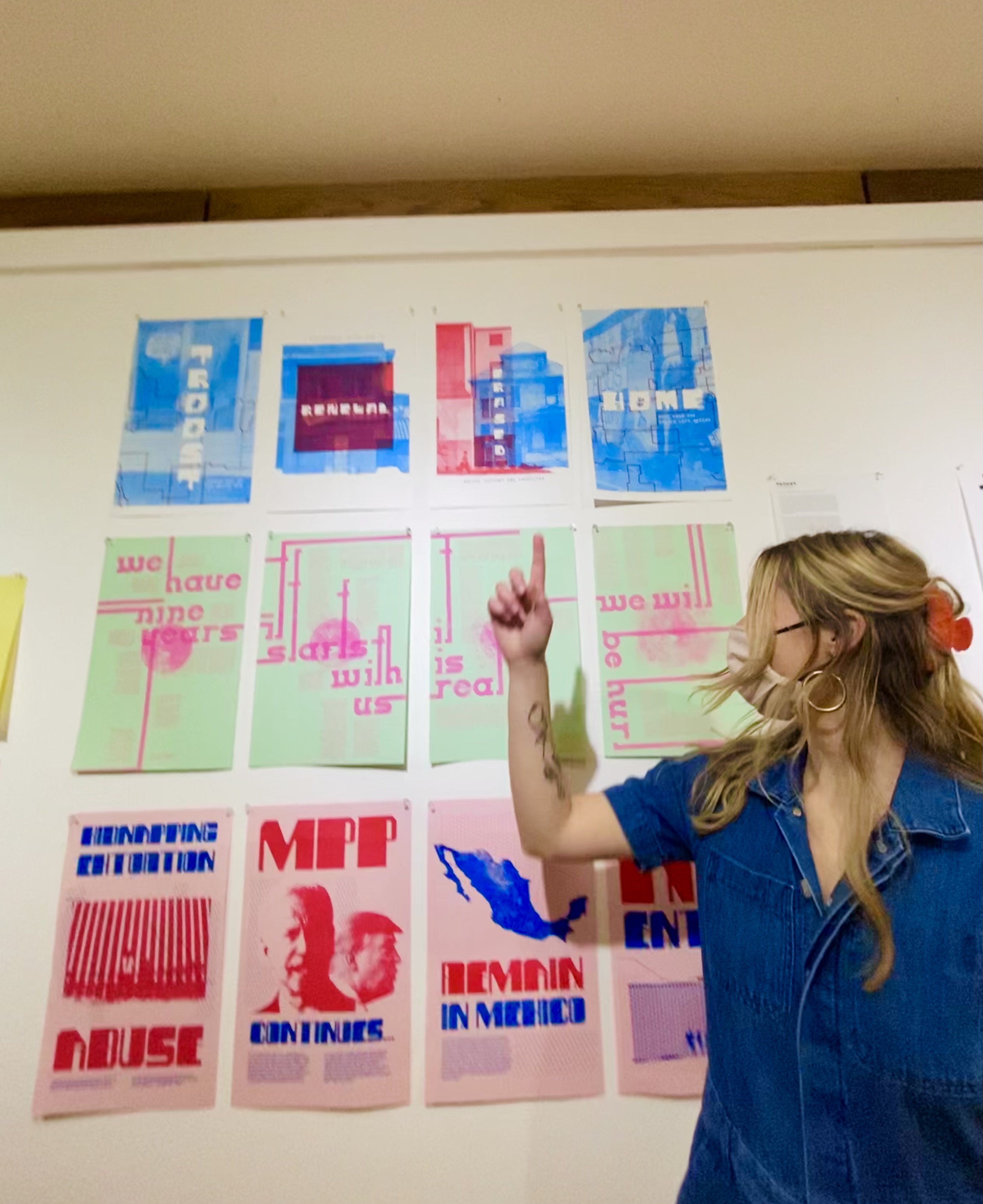
I developed four 11 x 17 risograph posters to showcase the typeface I designed and the issue of gentrification in Kansas City. These were displayed at Four x Thirty-Four, a risograph poster show on experimental type design by senior graphic design students in my program.

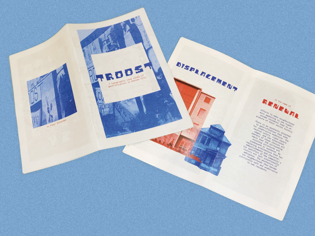
I also developed a zine, outlining Troost as a typographic case study. This walks through my research on the issue of gentrification of Kansas City, as well as the concept behind the design of my typeface.
︎︎︎ Return to Design Work Gallery